After long months, full of emotional moments for each European football fan, the EURO 2020 tournament is over. The tournament started with Andrea Bocelli serenading the Stadio Olimpico in Rome, and has ended with Italian captain Giorgio Chiellini lifting the European Championship trophy in London after a gripping penalty shootout victory over England.
To celebrate this event, Lingaro organized a data visualization contest. Below, we’ll give an overview of the competition, describe the winning entries, and provide some takeaways.
What was the subject of the dashboard and the sources?
This edition, we decided not to force participants to create dashboards for specific scenarios. Everyone could submit any subject related to the EURO 2020 Tournament.
-
The main source was a dataset from Kaggle, which included over 40000 results of international football matches, starting from the very first official match in 1972, up to March 2021. The matches range from FIFA World Cup to FIFI Wild Cup to regular friendly matches.
-
In May, when we shared Kaggle’s source about the football results, the information about penalties was not included there (today, July 2021 penalties are accessible). As one of the participants noticed, missing such important data can affect the predictions.
-
Many participants enriched the main data source with additional sources like FIFA ranking, footballers’ position and value on the market, red card history, stadium details, and even the TV schedule of EURO2020 (thank you Michal Filipczak, it was super helpful).
What kind of tools were used by the participants
One of the requirements of taking part in the contest was to publish the entry and make it publicly available. This edition, all of the participants decided to use Tableau Public or Power BI.
Some of the participants were focused on telling the history of the tournament, some presented fun facts, and some tried estimating who will be the winner of specific stages and even the final.
Did anyone predict the Winner?
Yes, two participants made a prediction model that indicated Italy.
Congratulations to Filip Dowgrid and Agata Jadczak!
Filip’s logic behind the prediction:
Two factors were taken under consideration – the direct results between teams throughout history (as a main variable) and current difference in pacing in FIFA ranking (as a coefficient of current national team performance).
.jpg?width=1024&height=576&name=Filip-Dowgrid-1024x576-(Compressify.io).jpg)
Check out the whole visualization here.
Agata’s logic behind the prediction:
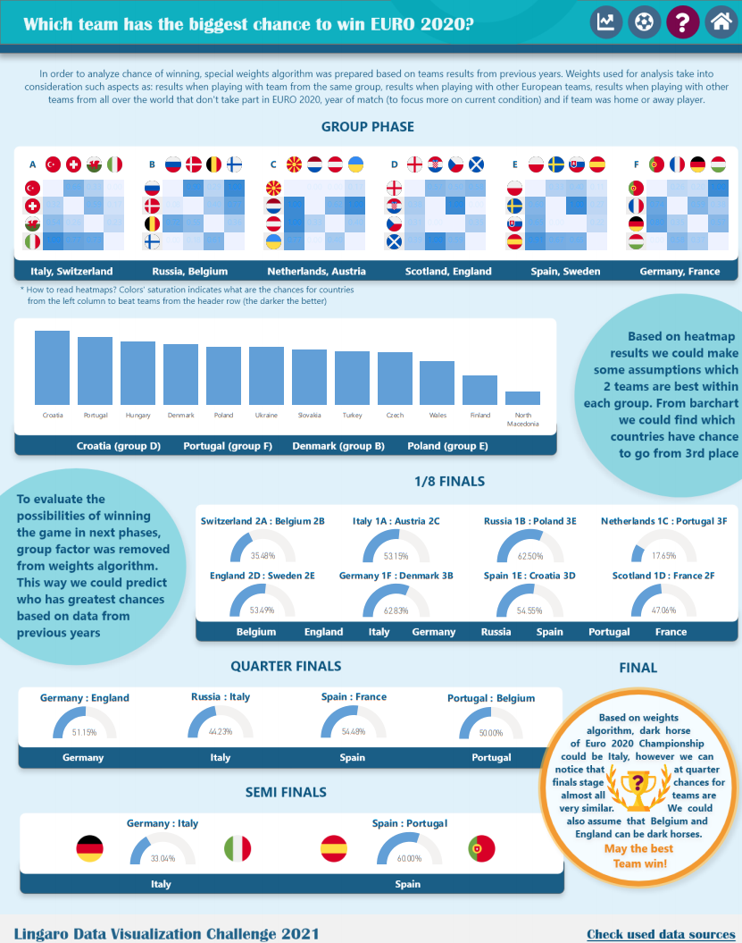
In order to analyze chances of winning, special weights algorithm was prepared based on teams results from previous years. Weights used for analysis take into consideration such aspects as: results when playing with team from the same group, results when playing with other European teams, results when playing with other teams from all over the world that don’t take part in EURO 2020, year of match (to focus more on current condition) and if team was home or away player.
Check out the whole visualization here.
Is the FIFA ranking a strong predictor?
While Filip used the FIFA ranking to predict the winner, another participant Wacław Piekara decided to investigate if the position of each team in the FIFA ranking is a good factor for predicting winners.
To find out the answer, download our EXTENDED CONTEST SUMMARY PDF.
The best entries and what we liked
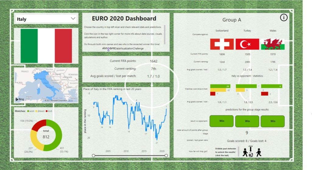
1st PLACE Agata Jadczak
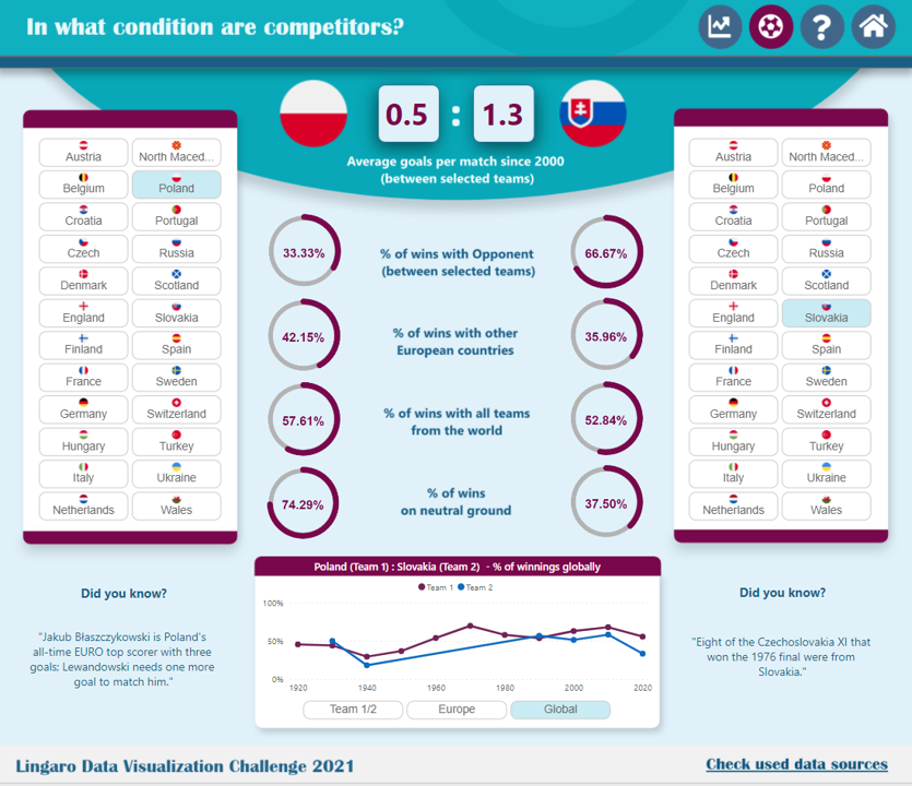
Check out the whole visualization here.
This is the 2nd edition of our contest in which Agata participated. It is amazing to observe her huge increase in skills. Well done, Agata!
Highlights of Agata’s work:
-
Good visual connotation with the official Euro branding.
-
Clear goal of each dashboard.
-
Clear navigation, including business questions.
-
On the competitors tab – clear and easy way to select pairs of countries.
-
The average goals per match are filtered just to the last 21 years.
-
Interesting fun facts about each team.
-
What could be improved?
We would suggest using better font formatting in the tab “How Euro looked like in previous years”.
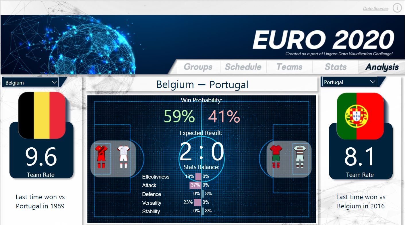
2nd PLACE Arnold Brytan
Check out the whole visualization here.
Highlights of Arnold’s work:
-
We found a lot of work and football passion here.
-
Large set of data used, only last years were taken into consideration.
-
It is not just a report, it is a powerful application.
-
Creative features like “Set up your squad”. We felt like a coach, choosing the tactics and squads – thanks for a lot of fun Arnold.
-
Consistent design and analytical approach – he built KPIs (Effectiveness, Attack, Defense, Versality, Stability and Team Rate), which could help with predicting the final score.
-
What could be improved?
We would suggest highlighting the most important information, create a story, reduce the number of tabs, just make it simpler.
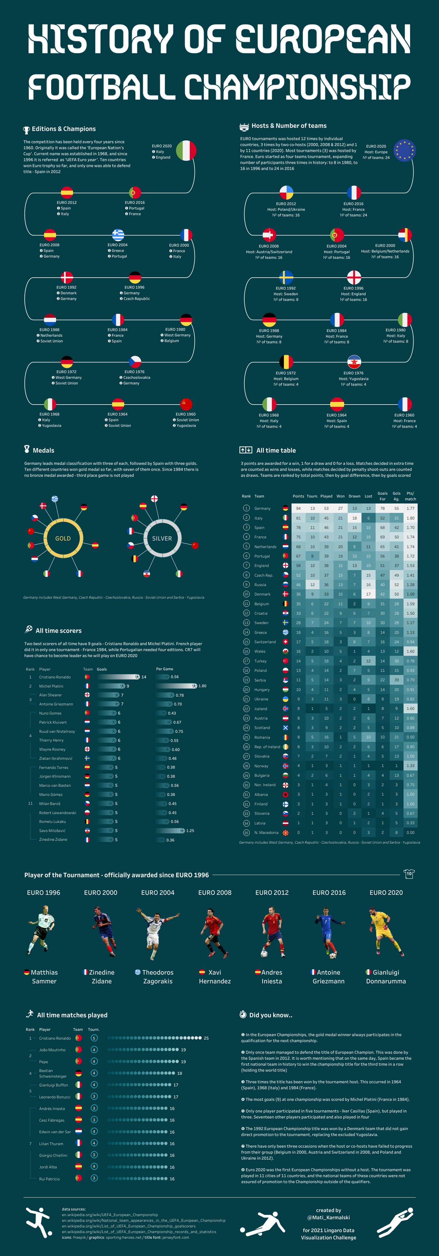
3rd Place Mateusz Karmalski
Highlights of Mateusz’s work:
-
Good UI.
-
Clean design improving readability.
-
Nice balance of viz and text, text is nicely split up.
-
Clear and simple message from the very beginning.
-
Top-down approach.
-
Descriptions with the insights.
-
Additional small descriptions – which tell us how Mateusz counted the points from Countries which after collapsing communism were transformed, e.g. Czech Republic – Czechoslovakia.
-
Limited colors. Turquoise background, white fonts – it really works well together. Mateusz played well with the color saturation between the two main colors. He reserved colors only for Flags. This makes this entry very readable.
-
Many interesting and fun facts about the EURO tournament. Did you know that since 1984 there is no third-place game?
-
What could be improved?
We would suggest making the dashboard a little more interactive.
Check out the whole visualization here.
Notable Mentions
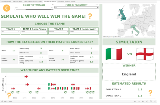
Filip Dowgrid – special recognition for predicting the best teams and the EURO 2020 winner
Check out the whole visualization here.
Highlights of Filip’s work:
-
Lots of information was organized into one place.
-
Navigation to the next dashboard is not very intuitive, but when it’s revealed – the user finds the real treasure – Filip’s predictions.
As mentioned before, Filip enriched the main data with the FIFA ranking. Based on two factors, the results between teams throughout the history (as a main variable) and the current difference in pacing’s in the FIFA ranking (as a coefficient of current national team performance), he anticipated the full path of the Tournament. Filip knew the Final battle will take place between Italy and England. He bet on Italy – with success.
-
The knockout chart is very well known to all football fans. It is easy to follow the winner’s path.
-
What could be improved?
We would suggest making a more mature layout, with different types of countries selection (dropdown requires a lot of clicks).
Anna Białas – special recognition for clean design and well-planned navigation
Check out the whole visualization here.
Highlights of Anna’s work:
-
Nice landing page and legend with instructions.
-
Consistent and clear design.
-
Intuitive navigation.
-
What could be improved?
The important question which should be asked is how to use the available data to make the analysis most accurate and valuable.
-
Do we need to use the whole range of years?
-
Should we use all available tournaments (including Friendly?) or rather just focus on the most important ones?
Michał Filipczak – special recognition for preparing the Lingaro Betting App in Power BI
Highlights of Michał’s work:
-
Many thanks to Michał for preparing the Lingaro Betting App in Power Apps.
-
Responsible design – the report opens on mobile phones in the same way as on the Desktop.
-
Custom Icons – when using on mobile, huge navigation icons help switch the tabs.
-
What could be improved?
Having titles and even small descriptions would be very beneficial. We would suggest less tables and more interactive visualizations.
Check out the whole visualization here.
Pro tips for the next round
The purpose of the analysis should be clearly communicated.
-
Think about the audience – who will be the final user. What might her/his needs be?
-
Adding insights and descriptions is beneficial for the final users.
-
Remember, if something is wrong, then we ask more questions about the report itself than have answers, insights. Very often – LESS IS MORE.
-
Be more focused on the composition and navigation.
-
Be sure to keep a balance between the visualizations, text, and spaces – don’t be afraid of using padding.
-
Super important nowadays: most social media users choose mobile apps, so don’t forget about mobile design.
-
Testing. Before completing a data visualization, do not be afraid of asking someone to review it. If he/she will not be able to understand it, you probably have to make some adjustments.
-
Choose your chart type wisely. Here is a good thought framework to use. When making a chart, think about what kind of questions you can ask and what kind of answers you can get.
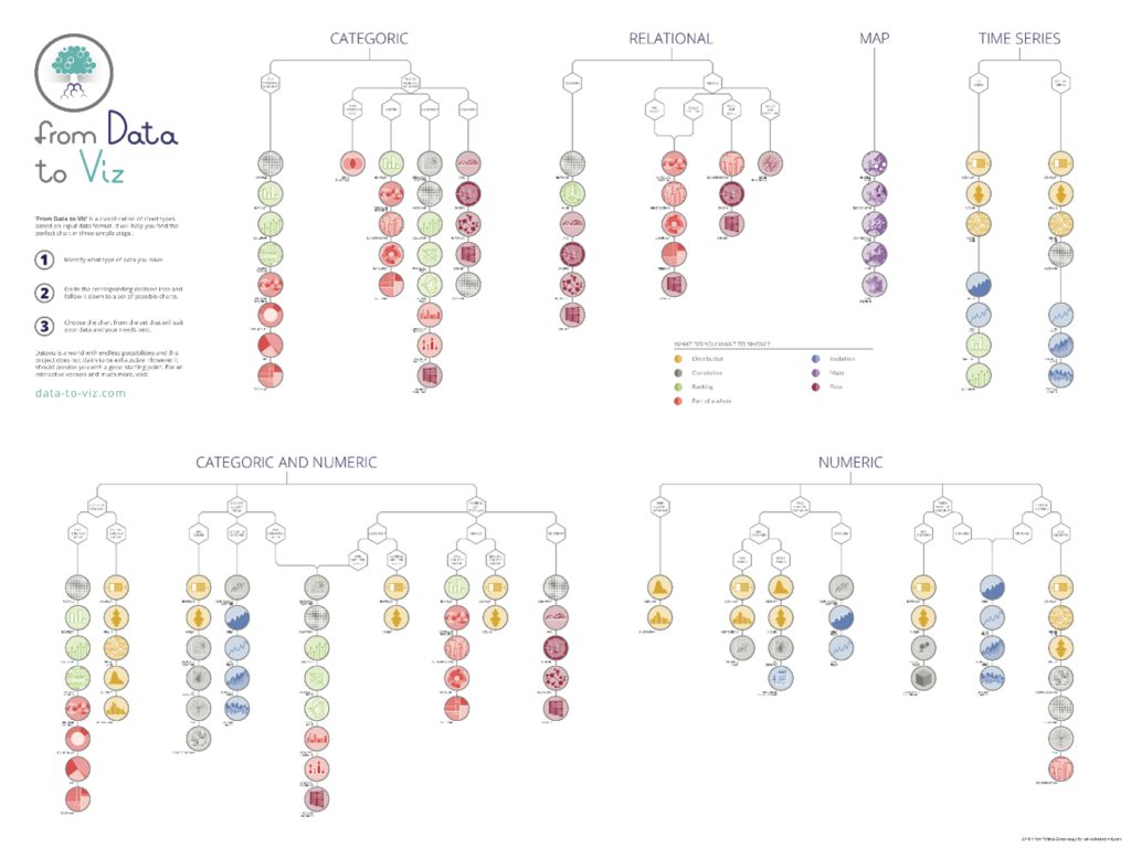
This picture is from Yan Holtz Conor Healy.
Extended Summary
If you want to see more insights and advice on the contest entries for the next round, we encourage you to download our EXTENDED CONTEST SUMMARY PDF, where you will find out:
-
The answer if the FIFA ranking is a good predictor.
-
When not to use Sankey’s diagram.
-
What are the problems with Radar charts?
-
Can we use a Radial chart to compare the results?
-
Comments about the composition.
-
Information about Data Overloading.
-
And much more.
We hope you enjoyed this contest and viewing its results.


.png?width=528&height=313&name=1476%20Databricks%20Post%20blog%20v1.3-(Compressify.io).png)