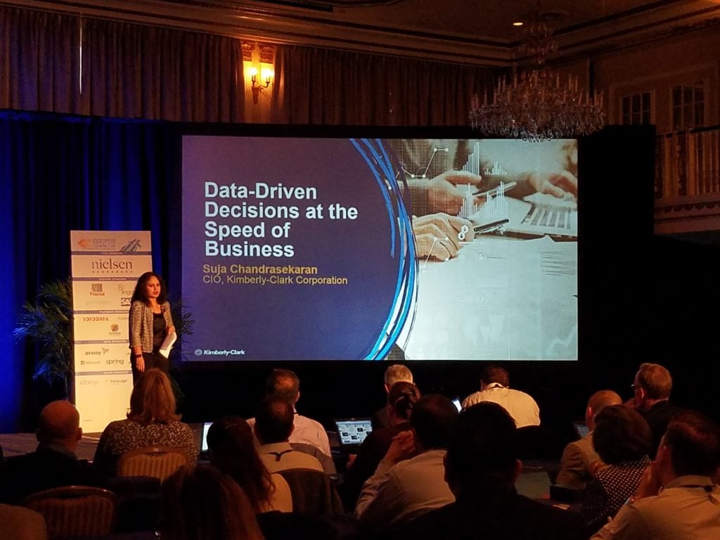
On April 26-28, the Drake Hotel hosted some of the top people in the Retail and Consumer Product Goods (CPG) industry.
Companies such as Procter and Gamble, Kimberly-Clark Corporation, Walmart, Duracell, General Mills and Unilever, spoke about Data & Analytics trends in their industry. Other companies like Nike, Starbucks, Mondelez International, McCormick & Co., Johnson & Johnson and Bayer Healthcare, also present at the Summit, shared their challenges and discussed ideas during the multiple networking sessions that took place.

The Drake, an Italian Renaissance style hotel, sits on the side of Lake Michigan and stands out on the north face of Chicago’s impressive skyline. This 97-year-old building, which became part of the Historic Hotels of America in 2014, was once frequented by many heads of state, assorted celebrities, and international personalities. Icons such as Bing Crosby, Walt Disney, George Gershwin, and Charles Lindbergh would sit at the glorious “Gold Coast Room” and listen to Herbie Kay while enjoying a cocktail. A place worth visiting if you are visiting the city.
Once hosted by Chicago’s social elite daily for tea, the hotel was now the place chosen for the 2017 Retail and CPG Analytics Summit (RCAS) organized by Retail Info Systems (RIS) and Consumer Goods Technology (CGT). A unique conference which combines Retail, CPG and Analytics topics in one single agenda. Lingaro was one of the sponsors at the conference.

The Summit provided an extraordinary environment for networking and discussions but above all, a place to learn. The number of attendees (in the range of 200) made it possible for lots of discussions during the session breaks or networking breakfasts/lunches. Versus other conferences I have attended, the venue provided the ideal conditions for participating in spontaneous discussion groups around different topics. It was all set for conversations to take place.
During day one of the Summit, Lingaro also had the opportunity to share the experience and approach to one of the most challenging areas that organizations face in Business Intelligence & Analytics, Data Democratization.
Making data available to everyone
Data democratization is one of those hyped buzzwords we hear about all the time. But what does data democratization exactly mean? We surely get a wide variety of definitions on what this is and how this should be applied in Enterprises.
Let’s start by covering the definition of democratization. To democratize means to make (something) available to all people and/or to make it possible for all people to understand (something). If we apply this to the world of Data & Analytics, we can define data democratization as “making data available to all employees in an organization and ensuring they have the right tools which make it possible to understand the data”. Still not clear on the concept of data democratization? Then check out this Beginners Guide To: Data Democratization.
In a world where data gets generated at such a fast pace, the biggest challenge that companies are facing now is how to effectively extract the value from all this volume of accumulated raw data. It is frequent to hear things like “90% of the data in the world today has been created in the last two years alone” or “companies only make use of 10% of data they have” but the question still remains on how then to monetize this asset.
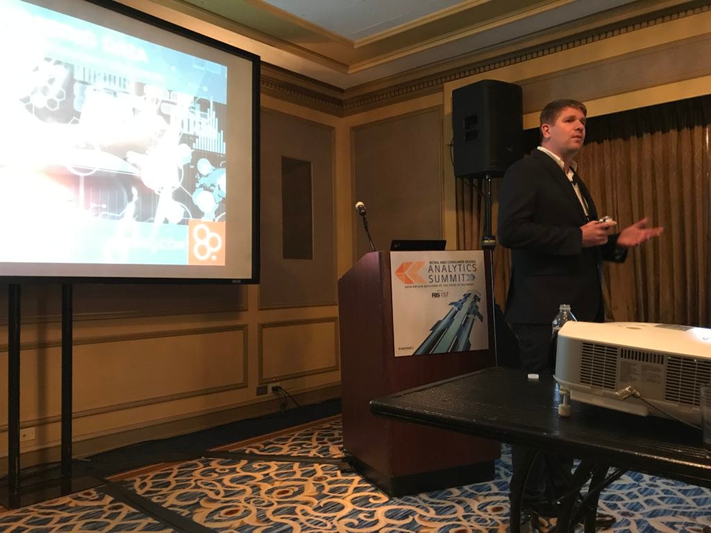
During our session, we described our approach to data democratization, in particular, how to follow a user-driven, technology-enabled approach to make it easier for employees to analyze, visualize and extract valuable insights from data. We did this by showing how to apply a simple 3 step process: Understand, Create and Refine.
Empowering employees through data visualization

The presentation which I had the pleasure to lead, covered a real case scenario and was aimed to provide a generous detailed description of how companies can successfully deliver data visualization solutions to their users.
The first part settled the stage by providing an overview of the situation and background of the problem we aimed to solve at our customer. This covered the first 10 minutes of the session. The remaining of the speech focused on sharing the three keys that we believe are necessary to be successful in delivering data visualization in a way that it can empower employees:
- Understand: The key of this phase was about the need of organizations to shift from the traditional BI solving approach based on requirements gathering to one which focuses on developing a deep understanding of the problem or need which the user has. As Scott Berinato defines in his book about Good Charts it’s important to take two dimensions into consideration to be successful in delivering the appropriate solution to users: design execution (How well it is constructed) and contextual awareness (What am I trying to do, to whom and where?). You can find a great overview of his concept in the article he wrote on Harvard Business Review, Visualizations That Really Work.
- Create: Once it is clear on what is the purpose and goal, the next phase is to build the solution. During this phase it is necessary to focus on both the User Experience (UX) and what we define as the Data Experience (DX). While a lot of people focus merely on developing beautiful visuals which are very easy to use and intuitive, we believe that if the data shown is wrong, as much as you have a great UX, users will not use your solution. So DX becomes a key component of success.
- Refine: Once the solution is developed, we can put it in the hands of users to evaluate and then learn and apply from the feedback we get.
Our approach has proofed to deliver successful solutions to business users in shorter time and with less effort than traditional BI solving.


