


With a growing interest in custom visuals, Lingaro custom Power BI specialists step in to support business users in their everyday tasks with free add-ins. See what our expert, Kamila Czuchraniuk, has to say about our universal tools that help bring data visualization ideas to life.
From your experience as a Business Intelligence Technology Consultant, what are some common challenges that Power BI users face?
Throughout my work I support many Power BI users – all from different industries, all with loads of data. But each business is unique and has its own needs and expectations when it comes to Power BI reporting. Typically, collecting and presenting in native Power BI visuals is not an obstacle, but getting to the specific insights is. So, it turns out that the native visualizations are not sufficient. Therefore, developers often turn to custom visuals to get the task done and to fulfill the needs of business users.
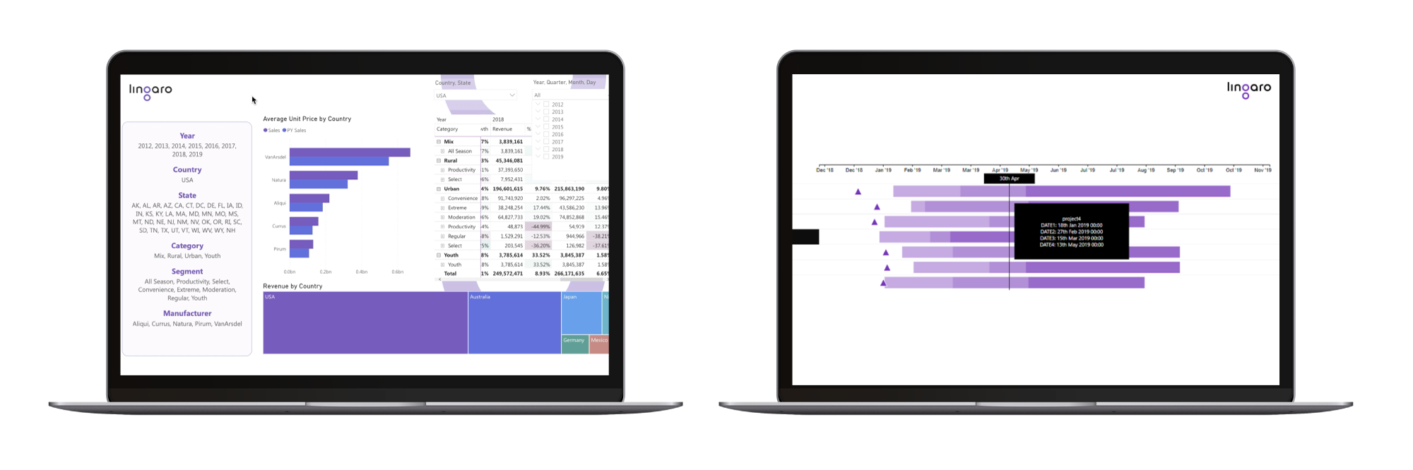
For example, we have often found that users from enterprise environments need to track several projects simultaneously. Having a comprehensive view into large portfolios of complex projects can give a lot of power and open-up many possibilities. So, to address this need, our team created custom visuals that are now available to anyone who wishes to boost their power BI reports. This was a natural step for us, as we aim to support all the business users in the Power BI community. We are proud that our custom visual solutions are available to everyone.
Responding to client needs is important, but such customized tools must be expensive. What about the costs?
The Lingaro Gantt Chart is free for everyone. We have a tutorial that covers the basic functions. It can be accessed from Microsoft’s AppSource at: https://appsource.microsoft.com/en-us/product/power-bi-visuals/lingaro.ganttbylingaro.
Our goal is to empower business users in the Power BI community who would like to track several projects using one tool.
Naturally, if a company will want to expand its capabilities to meet some specific needs, we are more than happy to help.
With so many custom visuals available out there, how do we know which one to choose?
I agree, this is a good point. There are a lot of custom visuals available online, including the official Microsoft AppSource. Personally, I think that this is great and proves how big the need is for such visuals. If someone wants to expand their options and enhance their Power BI reports – they just simply apply these add-ins. However, it can be difficult to choose the valuable visuals among this huge collection. Some of them have interesting features and some may seem to be free of charge. But there are also many that can require additional costs.
Our Lingaro custom visuals are totally free of charge and ready to use for anyone who needs them. We also provide graphics, samples, and detailed descriptions – so the users know exactly what to expect.
Is the Gantt Chart the only free custom visual from Lingaro?
Seeing that many users look for customized solutions, we decided to extend our offer and began developing an additional Power BI custom visual called “Dynamic Labels”. Dynamic Labels allow users to display a specific selection without creating any DAX calculations, so reports can be created much easier and faster.
What is the most important feature of Dynamic Labels that users should know about?
Dynamic Labels are great because they allow to:
-
Display multiple values using comma,
-
Show selected hierarchies, i.e. calendar dates (year, quarter, month) as a separate line or series,
-
Set customized limits for the presented values,
-
And they provide the user with unlimited editing capabilities.
While building Power BI reports, it might be useful to present a card visual. Unfortunately, the plain card visual can’t present a few values simultaneously – for example: it will show only one month, instead of multiple ones, even if the data is different.
So, this option allows to show what values have been selected and it can also be used to highlight some specific data points. To do this before, users had to create various combinations of DAX measures to reach their goal. But with our Dynamic Labels, all you need to do is drag and drop the desired fields into the custom visual to create an intelligent card. So, this feature really saves a lot of time and makes it clearer to see the results.
We recognize the potential and plan to develop more free-to-use Power BI visuals to publish in the AppStore, so please stay tuned for more info.