We have successfully finished the first edition of the LINGARO DATA VISUALIZATION CHALLENGE!
This one focused on Oscar awards data. In this article, we’ll give an overview of the competition, describe the winning entries, and provide some takeaways. But first, you might be wondering why we decided to use the Oscars theme this time.
Oscars are world-famous prizes that almost everyone has opinions about.
What’s the world’s most famous prize? Regardless of where they’re from, most folks would probably say a Nobel Prize or an Oscar. But is it likely that these folks would be familiar with a Nobelist’s literature or scientific discovery? Not as likely as they are to have seen an Oscar-winning movie!
And it’s not just cinema stars who look forward to the Academy Awards Ceremony every year. People all around the world are curious to see who will get Hollywood’s top honours. When it comes to our opinions about movies, we are all experts!
Everyone has his or her own favourite film directors, actors, or genres. But there are overall patterns as to which ones are popularly recognized as Oscar winners.
Using Academy Awards data to discover and share these patterns was the object of this competition.
Of course, it was inevitable that the contestants would also uncover some fun movie facts along the way. For example, you or someone you know probably still can’t believe Leonardo DiCaprio had to wait 23 years to get his Oscar in 2016. (Yes, he has one, despite any internet memes to the contrary!) But did you know that Paul Newman had to wait 28 years for his? Or that after 4 nominations and 40 years Alan Arkin finally got his? But the most patient Oscar winner would have to be 2x Oscar nominee Henry Fonda, who waited a full 41 years for his little golden statue!
The object of the competition in detail
The object of this competition was to prepare a data visualization reporting solution answering questions related to a thematic scenario. Contestants were free to come up with their own scenarios or base them on some our suggestions, e.g.
-
You are a movie producer and you want to know which type of movies you should invest in and what people you should hire in order to increase the chances of making a successful movie.
-
You are a movie blogger and you want to create interesting content about movies that have been nominated but never received an Oscar award.
-
And the Oscar goes to…? Predict which films and actors will be recognized by the Academy this year.
And the data visualization awards go to…
We are pleased to say we received some great entries made in a variety of data visualization technologies like Power BI Tableau and even in D3.js, Qlik and Looker. Choosing the winners was far from easy!
Winners
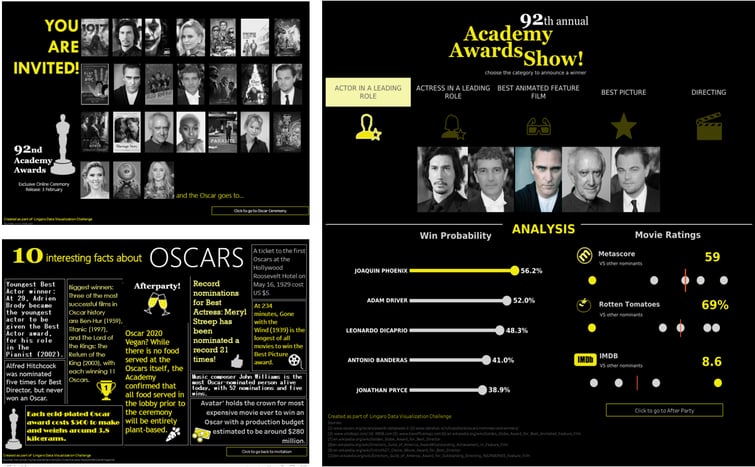
1st place– Bartosz Prusinowski – D3.js, analytics made with R
Bartosz really thought outside of the box! There was an insightful and brilliantly written story that leads the reader along a clear path to specific conclusions. Bartosz’s article is engaging and creative. The example movie plots he provided with a storyline generator are just waiting for a director to make them hits!
.jpg?width=1024&height=798&name=screen-8-1024x798-(Compressify.io).jpg)
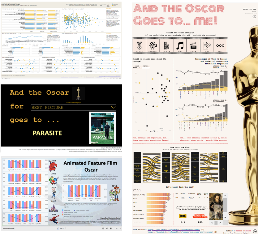
2nd place – Liza Nemczynova (Tableau, analytics made with Alteryx)
This one starts with nice landing page and gets even better with a predictive model in the background. Liza went so far as to enrich her analysis by including data on the SAG, Golden Globe, DGA, Critics Choice awards in her predictive model. She managed to combine advanced mathematics with a clean and consistent design. We appreciate the straight answers and we enjoyed the fun facts she provides.
Thanks to Liza, we now know that Alfred Hitchcock was nominated 5 times and never won! Well, the Academy doesn’t seem to go for horror, film noir, or thrillers ?
3rd place Agata Jadczak (Power BI)
Here’s a real business dashboard. Agata created a scenario in which she is an investor. Is producing an Oscar-winning movie a good business goal? It is worth investing in? Agata’s got the answers. Her dashboard includes customized navigation to other tabs where we can play with the data and get more insights. The questions and answers encourage us to discover more. Very good execution. Nice animations and consistent layout!
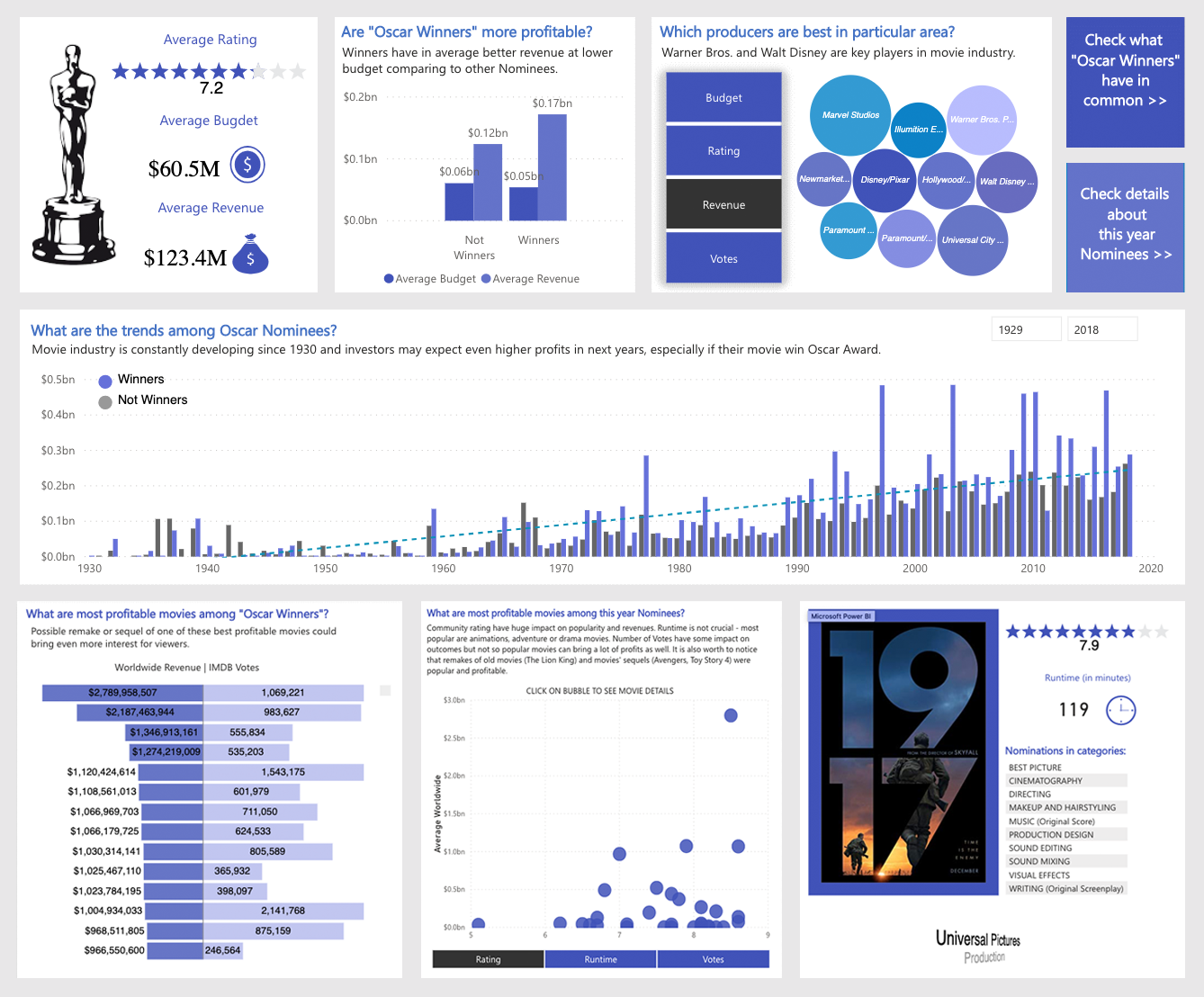
I am interested in the movie industry. I would like to know trends regarding revenue in this area. I am also interested in what the characteristics are for “Oscar Winners” in order to know what kind of movies are best recognized and worth investing in. I am also curious about latest trends and I would like to know more details about this year.”
Tomasz Kuczara – for a stunning first impression, nice composition, fun facts hidden by a button and annotations with insights – check out Tomasz solution here.
Katarzyna Lachewicz – for her focus on animated movies, informative annotations, and a “child-friendly” design – check out Katarzyna solution here.
Magda Gwizdała – She was the only one who was not surprised that Parasite won Best Picture category, she anticipated it. For very straight forward information. Good usage of the additional data set, that gives more insights and helps predict the winners more accurately – check out Magda solution here.
Insights
Through their efforts, Challenge participants identified four key takeaways related to genre, runtime, plot and budget.
When thinking about your next big movie, let’s try to focus on things like mysterious secrets that are being unveiled by the police and not on sons of famous, wealthy and old fathers (if you aim to win an Oscar, at least.”
Winners were usually Drama, Comedy or Romance movies. They presented mostly war and love themes.”
Some believe that money can buy everything, but this is not the case when it comes to winning an Oscar – budget of the movie doesn’t seem to be a differentiating factor there.”
There are two major groups of winning movies – first group are short films between 15 and 31 minutes and second are films which last usually from 108 up to 140 minutes. It means that there is no necessity to invest in very long movies.”
Conclusions and advices for the next round
During the assessment session, we took three criteria into consideration: design, analytical approach, and creativity. Each of the criteria was weighted equally.
Design
First impressions are powerful. We were very happy to see that most of the entries we received had well planned, clean compositions. Therefore, the time needed to get to the first insight was much shorter than if the visualization were cluttered by too many objects or distracting fonts or colors.
Good data visualizations are “lean and mean.” If you include filters, they had better serve a good purpose and of course they should work! Otherwise, leave them out!
Choose your chart type wisely. Many people face difficulties choosing a chart type to best present data. No one is a born visualization expert. The more visualizations you create, the more you understand why your first charts were not as informative/pretty as they could have been.
Here’s a good thought framework to use. When making a chart, think about what kind of questions you can ask and what kind of answers you can get.
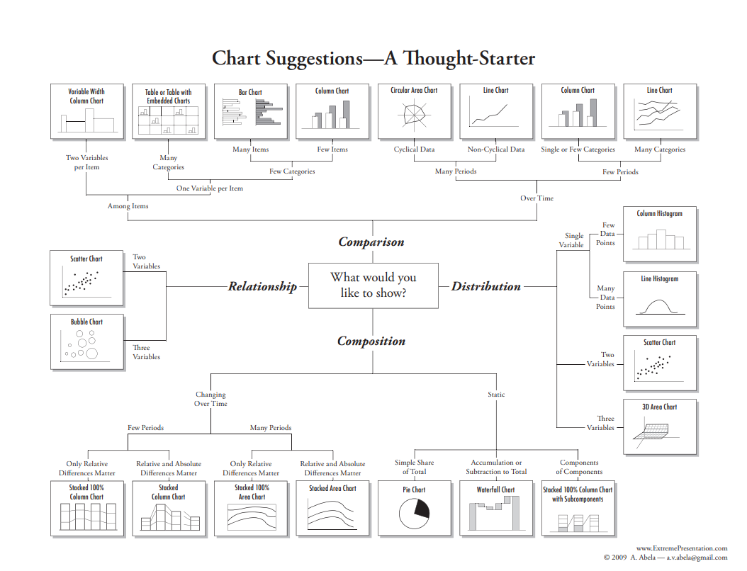
The picture comes from Andrew Abela, who hosts a blog called Extreme Presentation.
Decide what you are emphasizing. For example, quick access to the numbers or seeing the trend? Usually it is a good practice to add numbers and units to an axis, but not always. It depends on its purpose.
Before completing a data visualization, do not be afraid of asking someone to review it. If he/ she will not be able to understand it, you probably have some adjustments to make!
Analytical approach
When it comes to checking informational value, we primarily consider the purpose of the analysis. It should be easily communicated. Some people do it by asking a question; some people make an informative title. Explaining what they are doing and for what reason is a fundamental step that hyper-focused analysts often forget to take!
When we know the goal, we can assess how good, detailed, and useful the insights are in achieving that goal.
Be consistent. It can be controversial, but sometimes less is more. Imagine you have great, informative data visualization dashboard that allows you to answer many questions related to the dashboard’s purpose. But then you find something interesting but not so relevant. Not good! Think twice whether something really needs to be included. Inconsistency can lower your score.
Viewers like to see annotations that include conclusions drawn.
Creativity
Defining creativity is hard. Accordingly, the judges’ scores around this criterion varied the most widely. Why? Simply because there are many things that can be considered creative. You can’t catch them all. We do, however, appreciate it if someone enriches the data.
One concrete thing we will mention here – as experienced data visualization consultants who use these tools every day — is that when we see that someone experienced a given tool’s limitation and overcame it with a novel workaround, we are more likely to give points for creativity.
In conclusion, it’s difficult to engineer the WOW effect. It usually just happens – after you’ve spent many hours developing your Fingerspitzengefühl, i.e. an intuitive feeling for what works? Keep practicing!
We hope you enjoyed participating in this contest and / or viewing its results! And that this advice will help you next time.