


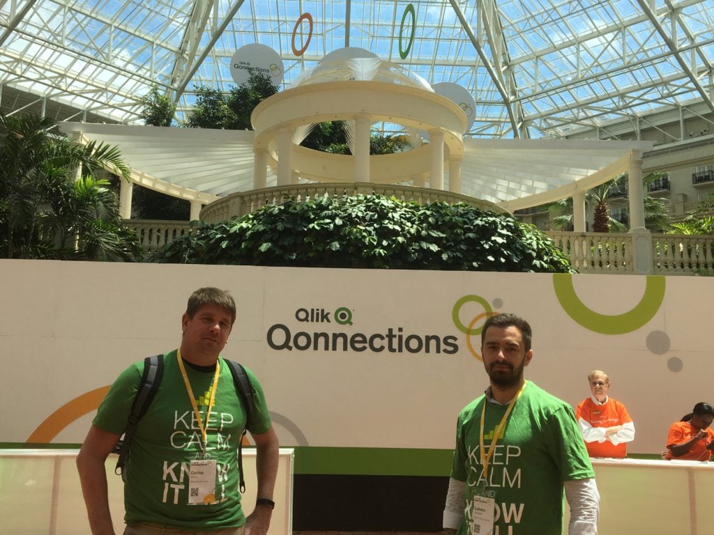
Though Lingaro only became a Qlik partner last September, during the last year we have considerably developed our capabilities, our experience and our people in this technology. The next step in our Qlik maturity journey was to join the annual user and partner conference, Qonnections. So, together with Łukasz Jastrzębski, we flew to Orlando ready to soak ourselves into four days of green experiences with other 3000 people coming from around the world.
Data + People + Ideas = Augmented Intelligence
Qlik allows companies to unleash the value of their data with visualization tools and their unique “Associative Model”, a powerful engine which makes it possible to discover how data is interconnected. It is therefore not surprising that the name of their Annual Conference is a combination of “Qlik” and the word “Connections”.
But Qonnections is not only about connecting data, it’s also about connecting people who share a common interest around this magnificent technology. It’s a place to share thoughts, ideas and experiences with people around the world who also use Qlik, it’s about humans getting Qonnected. This human factor is one that is clearly present in the way Qlik approaches technology.
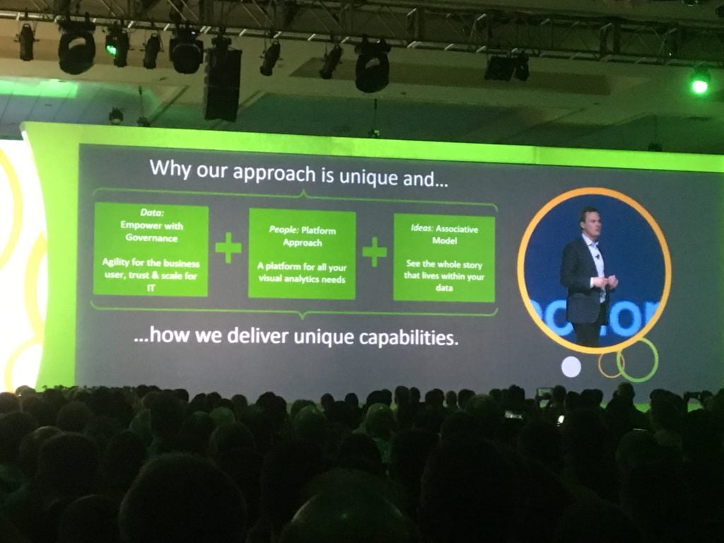
In times where everybody talks about Machine Learning, Artificial Intelligence, IoT, etc as if humans are or will no longer be relevant in BI and Analytics, Qlik proposes an approach based on the principal that humans still will play a key role in turning data into business outcomes. As James Fisher, vice president global product marketing, said during his speech on day one “Instead of Artificial Intelligence, we believe in Augmented Intelligence. People and data both play a role. People are at the center“.
Walking in the green
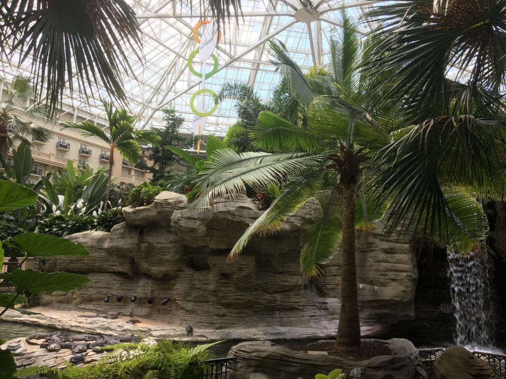
Qonnections took place at the Gaylord Palms and Resort Conference Center in Orlando, FL, an amazing hotel which looks more like an indoor Caribbean town. As you enter this amazing resort you realize the magnitude of the event you are about to experience. After crossing the main lobby you find yourself in an incredible green open space full of tropical plants, waterways, waterfalls, alligators and even a sailing boat floating on turquoise artificial salty water.
All covered by a gigantic glass atrium which helps keeping the Florida hot air from coming in (much appreciated) and provides magnificent natural light as well as a micro climate. Such an amazing place that I kept walking around during the breaks to see what new cool thing I could discover.
One of the things I appreciated most about Qonnections was the scope of the sessions. There was a nice mixture of Qlik related topics and generic subjects covering areas like data visualization and social marketing. Writing about all the learnings gathered during the event in one single article would be extremely hard, so I have decided to share my experience with three highlights:
A world of possibilities with Qlik’s open architecture
One of the key takeaways I have from all the sessions I had the pleasure to join is the world of possibilities that Qlik’s open API offers, with mashups being the one that fascinates me most. Mashups make it possible to develop fully custom visual applications which integrate with Qlik sense objects and it’s Associative Model.
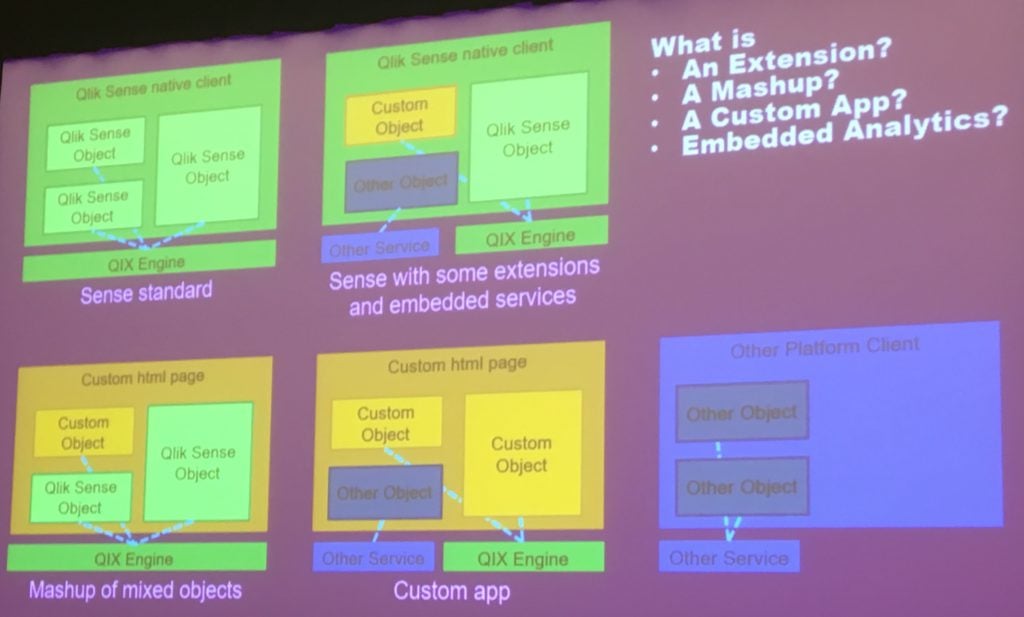
Mashups are a great example of Qlik’s “data, people & ideas” philosophy. It releases the creativity of your User Experience teams (human factor), who can build amazing visualizations and interactivity with no boundaries, yet leverages Qlik’s standard objects and the QIX engine (data factor). Your only limitation lies on the imagination and design skills of your people, the technology does the rest.
Even though at Lingaro we have experienced the possibilities with Qlik Sense mashups, extensions and embedded analytics for some time now and have our own service offering (Enjoy Analytics), it still continues to amaze me the visualizations people can create with mashups. If you would like to see mashups in action, the Marketing 360 application is a great example to view.
There are many options to leverage Qlik sense open architecture so just chose the one that fits your needs best. If you believe mashups is just what you need, I recommend you start here.
What You show is not what I see
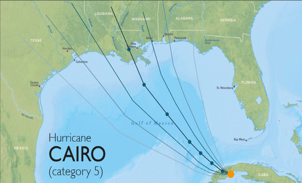
My personal best session was “Drawing data Visualizations” with Alberto Cairo and Randy Olson on day one. Cairo began the presentation by providing an excellent perspective about data visualization and the challenges of delivering truthful communication. He did this by showing some great examples about how visuals can be interpreted differently by different groups of people.
He used hurricane maps as an example of how one visual can be understood, erroneously, by each person and a proposal on how they could be drawn out to avoid confusion and misinformation. He then went on to list the three main causes which lead to this misunderstanding:
-
Showing the data incorrectly: depending on how you show your data, you can deliver different messages. In fact, Cairo recommends that different visualizations of the same data are often needed to convey the right message
-
Not including the right amount of data: choosing the right scope of data is critical to provide the right information that is supposed to be delivered
-
Not taking uncertainty into account (or interpreting it incorrectly): uncertainty can considerably influence the data you are showing so it’s important it is considered appropriately.
During the second part of the session we had the possibility to practice our learnings from Cairo’ presentation and create truthful communications using the Yale Climate Opinion Maps, a set of visualizations and data that the Yale University published regarding the opinion U.S. citizens had about global warming in 2016. The objective was to draw a mock up in paper of how we would tell a visual story about the data in order to properly communicate the information. The results of this exercise will be posted by Mark Bilotta in the Qlik Blog in June so stay tuned, I guarantee it will be worth it. I gave it a go myself and drew my own concept based on pictorial graphs using icons of people.
If you would like to read more great stuff from Alberto Cairo, I recommend you visit his blog The Functional Art.
Data and Analytics for Social Good
Though Qlik’s contribution to different Non Profit Organizations was covered during the first morning general session, it was not until I accidentally ran into a session conducted by Julie Whipple, Global Director Corporate Social Responsibility, about Qlik’s “Change Our World” program that I realized about the great work that Qlik is doing in this space. Through this program, Qlik and partners help NPOs to leverage the power of data with Qlik solutions in order to become more effective in their operations. This is done by providing free of license software, training or time from experts to develop the solutions. It is therefore not surprising that thanks to its Change Our World program, Qlik was among Fast Company’s Top Ten Most Innovative Companies in Social Good.
During the morning of day two, we also had a great inspirational and energetic session presented by Jake Porway, founder of DataKind, a company which uses data in the service of humanity. Porway talked about how DataKind supports social organizations by enabling data scientists to work together with social change makers to address tough humanitarian challenges together.
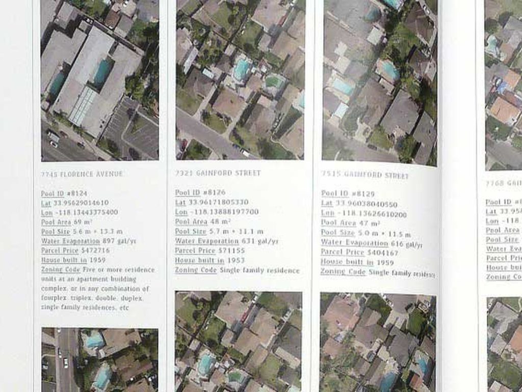
One of the stories that Porway used as an example of how data can be used for good was about cartographer Joseph K. Lee and interaction designer Benedikt Gross and their “Big Atlas of LA Pools”, which outlines 43,123 of L.A.’s pools.
This initiative, as Porway described, began when Gross flew to the U.S. for the first time for graduate school. As he flew into LAX, he saw a grid of pools out the window and was amazed and inspired to try to plot them all in an atlas. The initiative, called “43123 Pools I Have Not Visited and Never Will”, resulted in an atlas of 6,000 pages organized in 74 volumes where you can find the location and dimensions of the 43,123 pools.
The atlas also included a 22-minute video on Vimeo which was created using Google Street View images and Google Street and provides a tour of visiting the pools. So I guess you are wondering, why would having a map of every swimming pool in Los Angeles be an example of using data for social good? Well, this initiative has actually had two great uses. Firstly, it has been leveraged by the L.A.
Fire Department to help locate pool water in case of fires. Secondly, it was used to drastically reduce malaria rates in Africa where stagnant water in abandoned pools become a breeding ground for the mosquitoes that transmit this disease. By leveraging the technique used to create “The Big Atlas of LA Pools” it was possible to scan for potentially infected pools and eventually eradicate them.
Qonnections 2018
I’d like to finish this article with one of my favorite Steve Jobs quotes “life is about living experiences that are worth reliving”. The four days at Qonnections were a great experience for me, I enjoyed it from day one to the very last session and learnt a lot of new things, so I already look forward to joining Qonnections 2018. For next year I’d like to share my own story with the Qlik community and I’d like this to be around GeoAnalytics which is one of the coolest functionalities that Qlik has added to their portfolio of data visualizations in the last months. So hopefully at this time next year I will be writing about how this experience went.
.jpg?width=528&height=313&name=ISG%20AI_18234%202%20blog%20cover%20(3).jpg)

